Spiritual wall art isn’t just decoration — it’s intention you can see. The right symbols, colors, and materials can soften the energy of a space, invite calm, and remind you of who you are when life gets noisy. Whether you’re drawn to OM calligraphy, sacred geometry, serene mandalas, or minimalist nature art, the goal is the same: create rooms that support reflection, rest, and a more centered daily rhythm.
Below you’ll find a clear, practical guide to choosing pieces, placing them with purpose, and styling them so your home feels balanced and quietly alive.
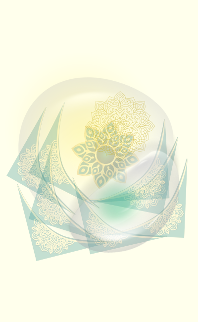
What “spiritual wall art” means today
It’s broader than one tradition or motif. Think of it as visual cues for inner peace:
- Symbols & scripts: OM, mantras, moon phases, zen ink, Sanskrit calligraphy, Hebrew lettering, or minimalist crosses.
- Geometry & pattern: Mandalas, Sri Yantra, Flower of Life — repeating forms that suggest order and wholeness.
- Nature as teacher: Mountains, oceans, botanicals, dawn/sunset gradients — simple, grounding references to cycles and presence.
- Minimal abstraction: Soft brushwork and gentle gradients that create atmosphere rather than “topics.”
Rule of thumb: choose pieces that soothe the nervous system first; then layer meaning.
Principles for effortless integration
- Calm over clutter. A single, well-scaled piece often outperforms a busy gallery. Let the wall breathe.
- Matte > glare. Matte paper or canvas softens light. If framing, use anti-glare acrylic or museum glazing.
- Natural materials. Light wood, bamboo, cotton mats, linen textures — they visually “exhale.”
- Scale with intention. Above a bed or sofa, aim for 60–75% of the furniture width. Triptychs can spread visual weight.
- Warm lighting. Dimmable 2700–3000K lamps, picture lights, or LED strips behind frames create a soft halo.
Choosing symbols with respect (and resonance)
- OM & mantras. Best where you’ll sit quietly: bedroom, meditation corner, reading nook. Keep styling simple and clean.
- Mandalas & yantras. Use one focal mandala instead of many small ones. Neutral palettes keep bedrooms serene; richer colors energize living rooms.
- Sacred geometry. Black-and-gold geometry fits modern spaces; soft sage/ivory suits boho or Japandi.
- Nature & moon phases. Organic shapes add peace without doctrinal baggage — perfect for shared spaces.
- Calligraphy. If you don’t read the script, source from artists who provide translations/context, and place with care.
Room-by-room ideas
Entryway
Set tone, not doctrine. A small OM or abstract gradient above a console, plus a bowl for keys and a tiny plant. Add a battery picture light for glow.
Living room
Choose one anchor: a large mandala, a serene landscape, or a geometry print. Balance with tactile textiles (woven throw, linen cushions). If you use incense, keep art out of the smoke path.
Bedroom
Go softer and lower contrast. A pair (moon phases + abstract wash) above the headboard calms the field of view. Use warm dimmable bedside lamps — light is part of the “art.”
Meditation / yoga corner
Keep walls uncluttered. One meaningful piece at eye level when seated. A light wood ledge can hold mala beads, a candle, or a tiny plant. Floor cushion + small rug = defined ritual zone.
Kitchen & dining
Think gratitude cues: subtle calligraphy, herbs/botanicals, sunrise gradients. Use wipeable frames or acrylic/metal prints to resist steam.
Home office
Geometry helps the mind focus. Pair a clean grid or yantra with soft greenery. Place art within your camera frame for video calls (credibility + calm).
Palettes that restore (and when to use them)
- Sage + sand + ivory: timeless, gentle, bedroom-ready.
- Charcoal + cream + brass: modern and grounded; great with sacred geometry.
- Blush + clay + linen: warm, human, softens minimal rooms.
- Indigo + midnight + gold: contemplative and dramatic for living rooms or studies.
Materials & finishes that matter
- Matte fine-art paper (archival): richest color with least glare; add a cotton mat.
- Canvas: painterly, forgiving texture; feels organic.
- Acrylic or metal: sleek and wipeable for kitchens/baths; pick satin to avoid mirror-like reflections.
- Frames: light oak, bamboo, walnut; rounded edges feel friendlier around beds.
Layout, sizing & height
- Single focal: center 6–8 inches above sofas/headboards.
- Pairs: align tops; keep 2–3 inches between frames.
- Triptychs: 1.5–2 inches spacing; center panel slightly larger or equal.
- Gallery rows: same bottom line above a console; mix sizes but keep consistent mats/frames.
A simple styling checklist
- One calming focal per wall (avoid competition).
- Warm light sources pointed near art, not directly on it.
- Natural textures in the room (wood, plant, woven textile) to echo the art’s softness.
- Scent with restraint. If you burn incense, ventilate and clean frames monthly.
Care, respect & sourcing
- Support artists who explain their symbols and use mindful materials.
- Clean with microfiber only; avoid harsh glass sprays.
- Keep art away from heavy moisture and direct heat.
- If a symbol is sacred to a tradition you don’t practice, display with humility and context.
How to start (3 steps)
- Choose the zone you want to soften (bedroom headboard, reading corner, desk).
- Pick one theme (OM calligraphy, geometry, nature) and a 3-color palette.
- Order one anchor piece at the right size, then add a single supporting print if the wall still feels empty.
When spiritual wall art is integrated with care, a room stops being a container and becomes a companion. Your walls won’t just look better — they’ll help you breathe better.
If you’re ready to explore how art works room by room, these guides will help you choose the right piece for each specific space in your home:
Art for Every Space
Where to Buy and or Where to Sell your Art:
Bundles and Marketplaces
Want to learn more about everything Print on the Hand has to offer? Click here to see all categories together:
Categories