Color is the quiet force that speaks before your artwork even has a chance to introduce itself, color palettes mood themes. It shapes emotion, sets the tone, and guides the viewer’s internal response within milliseconds. This is why color palettes and mood themes are foundational elements in design and digital art: they define the emotional identity of a piece long before style, composition, or symbolism come into play. In the world of print decor and digital collections, mastering the psychology of color is one of the most powerful tools a creator can possess.
Color isn’t simply visual—it’s psychological, cultural, contextual, and even seasonal. A shift from deep terracotta to soft sage green can transform a piece from grounding and nostalgic to fresh and rejuvenating. Artists who understand this dynamic can build collections that are not only beautiful but highly marketable, tapping into emotional needs that audiences often can’t articulate into words.
The Emotional Language of Colors
Every color carries its own emotional weight. While interpretations can shift slightly based on culture or personal history, modern digital art follows a fairly consistent emotional map:
- Warm tones (reds, oranges, golds): energy, excitement, passion, motivation
- Cool tones (blues, greens, teals): calm, clarity, balance, serenity
- Neutrals (beige, cream, charcoal, stone): stability, softness, grounding
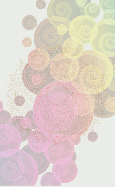
- Pastels (pinks, lavenders, mint): delicacy, hope, nostalgia, innocence
- Deep tones (navy, burgundy, forest green): luxury, depth, introspection
- Brights (cyans, yellows, hot pink): creativity, playfulness, optimism
When designing prints for decor lovers, bundle buyers, or collectors, your color palette often determines:
- Who buys your art
- What kind of space it fits
- Whether it feels modern, classic, or outdated
- Whether it evokes emotion or falls flat
Color is not an afterthought—it’s the backbone of emotional design.
Mood Themes: The Invisible Architecture
Where color shapes emotion, mood themes guide narrative. A mood theme is a general emotional direction—calming, uplifting, mysterious, dreamlike, romantic, energetic, minimalist, meditative. These themes help you craft a consistent vibe across a collection or series.
For example:
- A “calming” mood theme often uses earth tones, soft gradients, blues, and greens.
- An “uplifting” theme leans into pastels, bright accents, and airy backgrounds.
- A “luxury” theme may incorporate deep emerald, gold accents, and dark neutrals.
- A “dreamscape” theme often blends lavenders, midnight blues, and soft glowing whites.
Mood themes help your audience understand the intention behind your work. They also create a predictable emotional experience across multiple pieces, making them ideal for bundles, galleries, and curated sets.
How Color Palettes Shape Collections
In Print on the Hand, many creators use collections rather than single prints. This means your color palette becomes part of your brand language. A consistent palette across 6–12 pieces makes your collection feel unified, intentional, and ready for professional interior decoration.
Some examples of palette-driven collections:
- Monochrome Serenity: soft creams, whites, pale beige
- Earthbound Warmth: terracotta, burnt sienna, clay, muted greens
- Botanical Freshness: sage, emerald, pear green, pale gold
- Modern Luxe: navy, charcoal, warm gold
- Retro Pop: mustard, cyan, cherry red
Once a palette is chosen, creating variations becomes easier and faster. This is how creators build large bundles efficiently while maintaining a high perceived value.
Seasonal & Trend-Driven Palettes
Colors move in cycles, influenced by culture, fashion, interior design, and technology. For example:
- Spring: soft greens, pinks, lavender, peach
- Summer: turquoise, bright coral, sunflower yellow
- Autumn: rust, olive, chocolate brown, goldenrod
- Winter: deep blue, silver, stone grey, forest green
Understanding seasonal color cycles helps you time your collections to audience demand. It also aligns perfectly with print bundles that live within Seasonal & Holiday Bundles (https://printonthehand.com/bundles-marketplaces/seasonal-holiday-bundles).
Colors also shift with macro trends—minimalism, maximalism, cyber aesthetics, neo-surrealism, muted naturals. Riding those waves can multiply your visibility and sales.
Applying Color intelligently
Every creator should build a personal “visual dictionary” of palettes and mood themes. You don’t need to memorize psychology charts—you need practical frameworks that help you design faster with more emotion.
Try these methods:
- Start with a dominant color, then pick 2–3 supporting tones
- Use a neutral anchor so your palette doesn’t collapse visually
- Consider what mood you want the viewer to feel instantly
- Test your palette on mock-ups (it changes everything)
- Build color series, not isolated pieces
This is how you create collections that feel cohesive, emotional, and market-ready.
How This Ties to the Larger Category
This article lays the foundation for everything else in Category 8.
From here, you’ll be ready to explore:
- 8.2 Popular Art Styles Explained — which styles pair best with which palettes
- 8.3 Symbolism & Hidden Meanings — the deeper message behind your color choices
- 8.4 Signature Motifs — how repeated forms work with consistent palettes
- 8.5 Digital Design Trends — current color systems dominating online markets
Understanding color elevates your entire creative identity.
If you’d love to keep exploring how artistic styles, visual language, and creative trends shape the way we experience art, continue your journey here:
Styles, Themes & Trends
If you’re interested in discovering how these visual concepts translate into meaningful emotional expression, take the next step here:
Emotional Impact Art
Curious to explore everything Print on the Hand has to offer across all categories and creative paths? View the full collection here:
All Categories